Notes - CSS in Depth
Nearly every web programmer I met says: I know CSS, even someone told me “CSS is simple”. So they naturally write CSS in their skill set of CV. But wait, just writing several lines of CSS statements does not necessarily mean you are a qualified CSS user. This is the reason why I plan to learn CSS in depth. What I expect is to get a solid knowledge about how to write large scale CSS and understand why it works when layouting or styling.
Cascade, specificity and inheritance
terminology
A declaration includes a property and a value: color: black;
A ruleset includes a selector and a declaration block which contains a group of declarations.
body {
  color: black;
  font-family: Helvetcia;
}
cascade
The cascade is the name for this set of rules. It determines how conflicts are resolved, and it’s a fundamental part of how the language works.
When declarations conflict, the cascade considers three things to resolve the difference:
- Stylesheet origin—Where the styles come from. Your styles are applied in conjunction with the browser’s default styles.
- Selector specificity—Which selectors take precedence over which.
- Source order — Order in which styles are declared in the stylesheet.

origin
There are different types, or origins, of stylesheets. Yours are called author styles; there are also user agent styles, which are the browser’s default styles. Your styles will always override the user agent styles because the origins are different.
!importantis used to raise a declaration to a higher-priority origin.
specificity
inline style
Inline styles have no selector because they are applied directly to the element they target.
Inline declarations will override any declarations applied from your stylesheet or a <style> tag.
To override inline declarations in your stylesheet, you’ll need to add an !important to the declaration, shifting it into a higher-priority origin.
selector specificity The exact rules of selector specificity are:
- If a selector has more IDs, it wins (that is, it’s more specific).
- If that results in a tie, the selector with the most classes wins.
- If that results in a tie, the selector with the most tag names wins.
Pseudo-class selectors (e.g,
:hover) and attribute selectors (e.g,[type="input"]) each have the same specificity as a class selector. The universal selector (*) and combinators (>,+,~) have no effect on specificity.
Pitfalls: Many times developers write selectors using IDs, without realizing this creates a higher specificity, one that is hard to override later. If you need to override a style applied using an ID, you have to use another ID.
source order
If the origin and the specificity are the same, then the declaration that appears later in the stylesheet — or appears in a stylesheet included later on the page — takes precedence.
inheritance
If an element has no cascaded value for a given property, it may inherit one from an ancestor element.
Not all properties are inherited, however.
Primarily properties pertaining to text:
colorfont,font-family,font-size,font-weight,font-variant,font-styleline-height,letter-spacingtext-align,text-indent,text-transformwhite-space,word-spacing
List properties:
list-style,list-style-type,list-style-position,list-style-image
Table border properties:
border-collapse,border-spacing
special values
Two special values which can be applied to any property: inherit and initial.
inherit
- use inheritance to take place when a cascaded value is preventing it.
- force inheritance of a property not normally inherited, such as border or padding.
initial
- reset a property to its default value to undo styles
initialvs.auto: Sometimes, you can use the valueautodo the same thing withinitial, that’s because some properties’ default value isauto. Butautoisn’t the default value for all properties.
display: initialalways reset todisplay: inlineregardless of what type of element. Becauseinitialonly resets the default value of property, NOT the element.
shorthand properties
Most shorthand properties let you omit certain values and only specify the bits you’re concerned with. It’s important to know, however, that doing this still sets the omitted values; they’ll be set implicitly to their initial value.
order of shorthand values
- top, right, bottom, left:
margin,padding - horizontal, vertical:
background-position,box-shadow,text-shadow
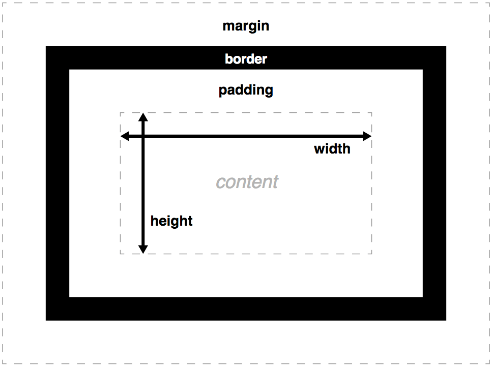
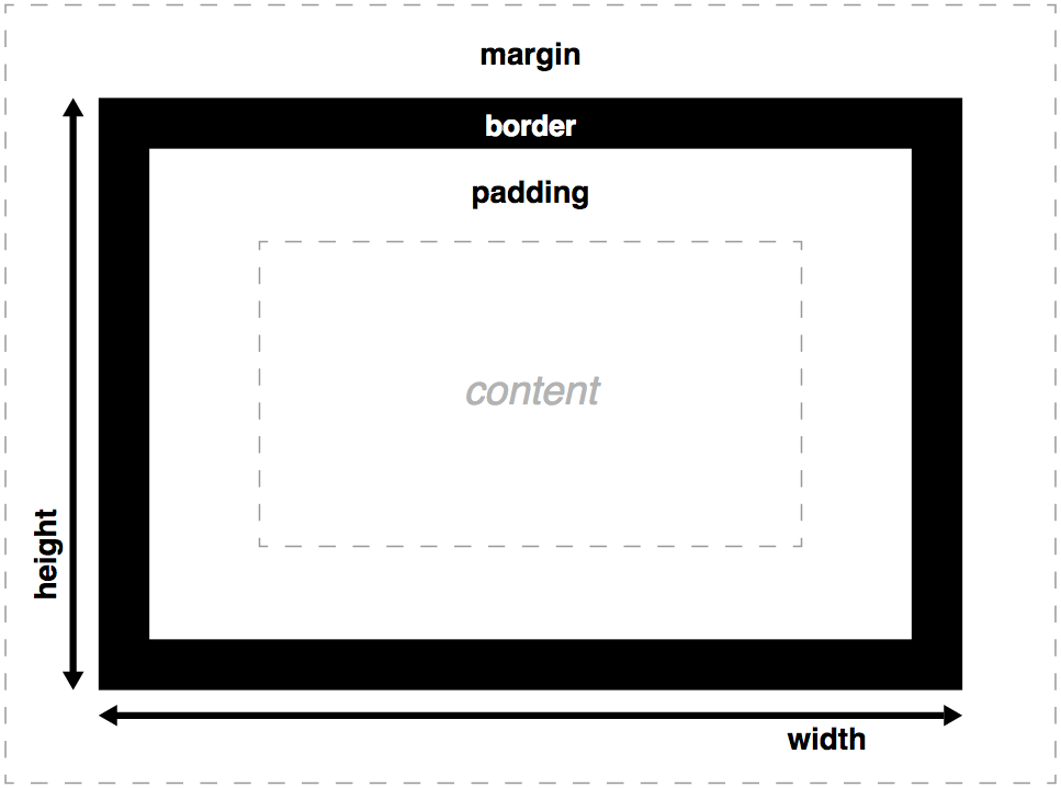
Box model
default box model

It includes 3 boxes:
- content box
- padding box
- border box
Margins don’t belong to these boxes.
background extend to border box by default
<div>
test
</div>
div {
margin: 20px;
padding: 20px;
border: 20px solid rgba(0,0,0, 0.5);
background-color: #0000FF;
}
This can be changed by background-clip property:
background-clip: border-box;background-clip: padding-box;background-clip: content-box;
- Box heights don’t observe percentage lengths; box height always adopts the height of the box content, unless a specific absolute height is set (e.g. pixels or ems.)
- Borders ignore percentage width settings too.
- tweak the box model with
box-sizing: border-box
Normal box model
Tweaked with box-sizing: border-box
Positoning
position: staticthe default position in the normal document flow. You cannot settop/bottom/lef/rightproperties.position: relativesets a scope for an element which will layout relative to it original position.positon: absolutemakes the element out of the normal document flow which means it looks non-existent for its surrounding elements. It is relative to the nearest positioned ancestor withposition: relative/absolute, otherwise relative to the viewport.position: fixedrelative to the viewport.
difficulties with element width
By default, width and height is for the content box. So it is hard to align two columns sometimes.
To avoid magic number when layout, a solution is use the calc() function to reduce the width by exactly that much.
adjusting the box model
By setting box-sizing: border-box, the box model is adjusted.

universal fix for border-box sizing
*, ::before, ::after {
    box-sizing: border-box;
 }
More robust fix when using 3rd-party libraries.
:root {
   box-sizing: border-box;
}

*,
::before,
::after {
   box-sizing: inherit;
}
adding a gutter between columns
A easy way is to add a percentage margin. But the gutter’s width is based on the outer container’s width. An em-based gutter is preferred: use calc() function.
.sidebar {
  width: calc(30% - 1.5em);
  margin-left: 1.5em;
}
difficulties with element height
Typically, it is best to avoid setting explicit height, because normal document flow is designed to work with a constrained width and an unlimited height. Contents fill the width of the viewport and then line wrap as necessary. Because of this, the height of a container is organically determined by its contents, not by the container itself.
heightproperty don’t support percentage value. Never.height: 100%
When you explicitly set an element height, you run the risk of its contents overflowing the container.
overflow, overflow-x, overflow-y
visiblehiddenscrollauto
alternatives to percentage-based heights
Specifying height using a percentage is problematic. For percentage-based” heights to work, the parent must have an explicitly defined height.
Columns of equal height
display: table rescues this difficulty.
.container {
    display: table;
    width: 100%;
 }

 .main {
    display: table-cell;
    width: 70%;
    background-color: #fff;
    border-radius: .5em;
 }

 .sidebar {
    display: table-cell;
    width: 30%;
    margin-left: 1.5em;
    padding: 1.5em;
    background-color: #fff;
    border-radius: .5em;
 }
Units / Relative Units
absolute units
- pixel:
px - point:
pt,pc - others:
mm,cm,inch
Ems and rems
em
em is ideal for padding, margin, border-radius
If using em for font-size, there is a bit tricky, because em in font-size is computed based on inherited font size, which can cause the shrinking font problem.
ul {
    font-size: .8em;
}

rem
Pseudo-class selector
:rootis equivalent to using the type selectorhtml. The<html>element is the top-level (or root) node of DOM.
rem is short for root em. rem is well suited for font sizes: font-size.
viewport-relative units
viewport — The framed area in the browser window where the web page is visible. This excludes the browser’s address bar, toolbars, and status bar, if present.
vh: 1/100th of the viewport heightvw: 1/100th of the viewport widthvmin: 1/100th of the smaller dimension, height or widthvmax: 1/100th of the larger dimension, height or width
vh is well suited to specify element heights or widths.
:root {
    font-size: calc(.5em + 1vw);
}